Case Study:
Home Depot
The goal of this case study was to help Home Depot’s “Doers Get More Done,” through the addition of a new DIY feature in the existing app.
Disclaimer: This is a concept project and has no relationship to the actual company.
ROLE
User Research
Interface Design
TEAM
Ralph Dela Cruz
Jaimee Mathew
Kammu Pokharel
CLIENT
Home Depot
DURATION
2 weeks
How Doers Get More Done
🛠️
How Doers Get More Done 🛠️
How might we guide users during DIY projects so that they aren’t lost and confused?
Home Depot has an expansive smartphone app with many built-in functions that aid a user’s shopping experience, but the company’s own research findings suggest more users need assistance with their home-improvement and DIY projects.
Users engage in DIY projects as a way to build something that is within their control. They enjoy researching and organizing DIY projects on their own, but value the knowledge of an expert in order to be fully confident in their specific plans. However, when unexpected problems come up during their projects, they feel unprepared to handle them.

While initial screener surveys helped our team narrow down our search to the most relevant users, our user interviews and affinity mapping gave us strong Insights into who our users were, why they engaged in DIY projects, and what areas they needed help with, which were simplified into four main categories, accompanied by real user quotes.
ORGANIZATION
Users need help staying organized, so they can avoid making mistakes.
“While shopping, I just rely on memory. It would be awesome if I had a system, but I truly don’t!”
PROBLEM SOLVING
Users utilize the Internet as a problem solving tool when they run into problems with their DIY project.
“If it’s something I can’t think through, I look online… at Reddit, looking at similar issues that other people have.”
EFFICIENCY
Users need to find products quickly and easily when shopping in-store, or else they become confused.
“I use my phone to locate the products and things I want to buy in the store!”
EXPERTISE
Users rely on an expert’s opinion when they need help.
“It’s very helpful having great insights from experienced people!”
Our users are experienced, but not professionals. They have a proactive mindset, but are hindered by their own natural disorganization.
These traits were reflected in our Persona: Handy Randy

“According to my calculations, this project will be done in 21 hours, 4 minutes, and 32 seconds!”
BIO
Randy is an enthusiastic young professional working in IT, and recently bought his first fixer-upper home. He listens to self-improvement podcasts during his 5AM cold showers every weekday, and takes pride in being Employee of the Month at his job for the past three months straight. On the weekends, he engages in DIY and home-improvement projects around the house. Unfortunately, his proactive, tech-savvy mindset is oftentimes at odds with his less-than-perfect organization skills. He relies on his local Home Depot for all his shopping needs, but can't help but accidentally leave a hammer behind! Nonetheless, his resourcefulness and unwavering commitment to self-improvement make him a strong DIYer and home owner.
FRUSTRATIONS
Struggles with unexpected obstacles that disrupt project timelines and budget
Feels overwhelmed when project management is disjointed and inefficient
Feel powerless when he can’t find answer to his problem
GOALS & MOTIVATIONS
Wants to complete DIY projects with minimal user errors
Values learning and gaining new skills to enhance future projects
Strives for personalization in his living space, transforming it to reflect his unique taste and preferences.

The Problem
Users engage in DIY projects as a way to build something that is within their control. They enjoy researching and organizing DIY projects on their own, but value the knowledge of an expert in order to be fully confident in their specific plans. However, when unexpected problems come up during their projects, they feel unprepared to handle them.
Learning what our users needed prompted the team to ask ourselves, “How might we help them?”
Our team crafted the following questions to design for preparation before, guidance during, and organization throughout our users DIY process.
How might we prepare users as much as possible before taking on a DIY project?
How might we guide users during DIY projects so that they aren’t lost or confused?
How might we organize the information users need during the DIY project so it is easily accessible?

The Solution
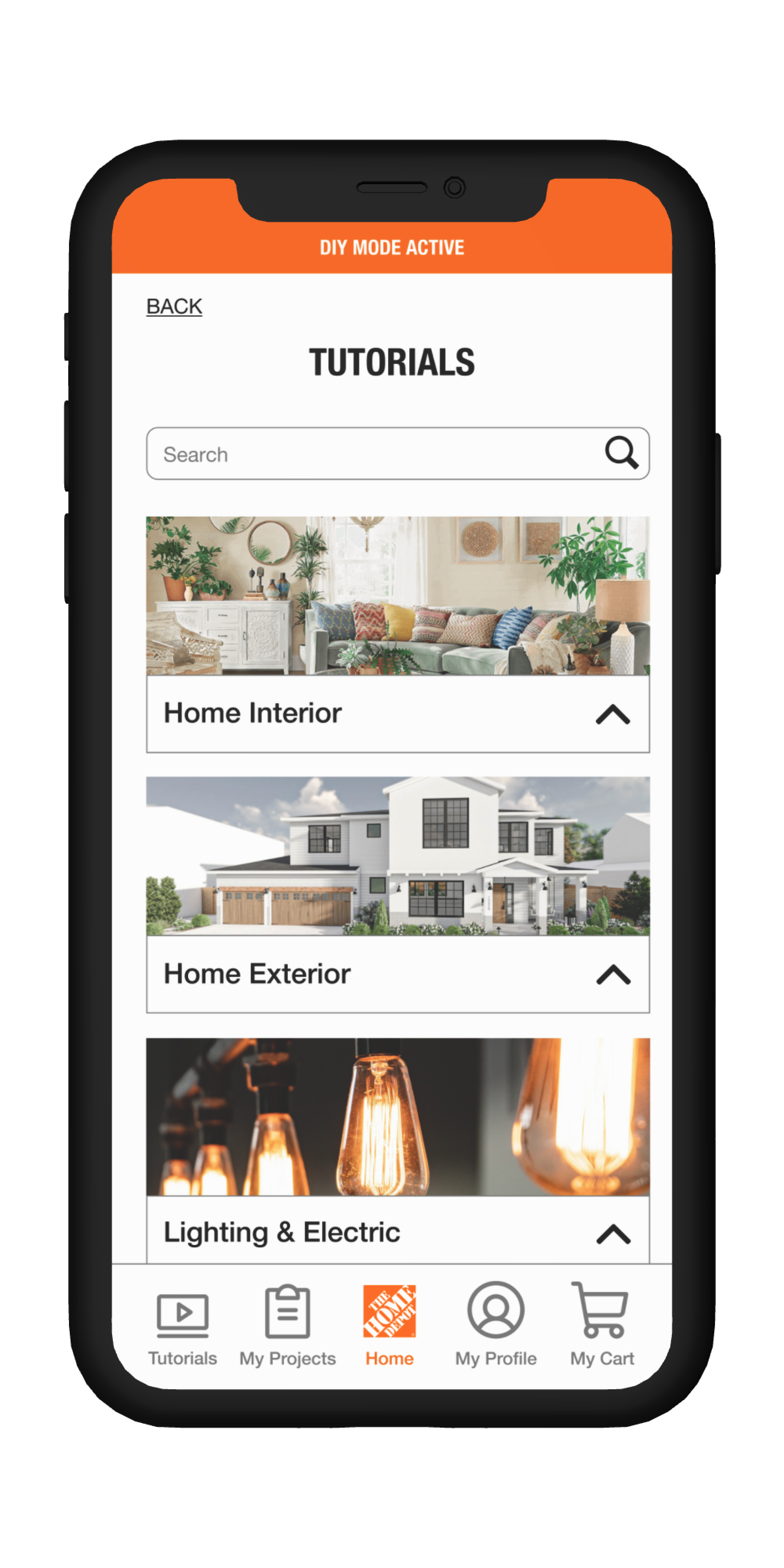
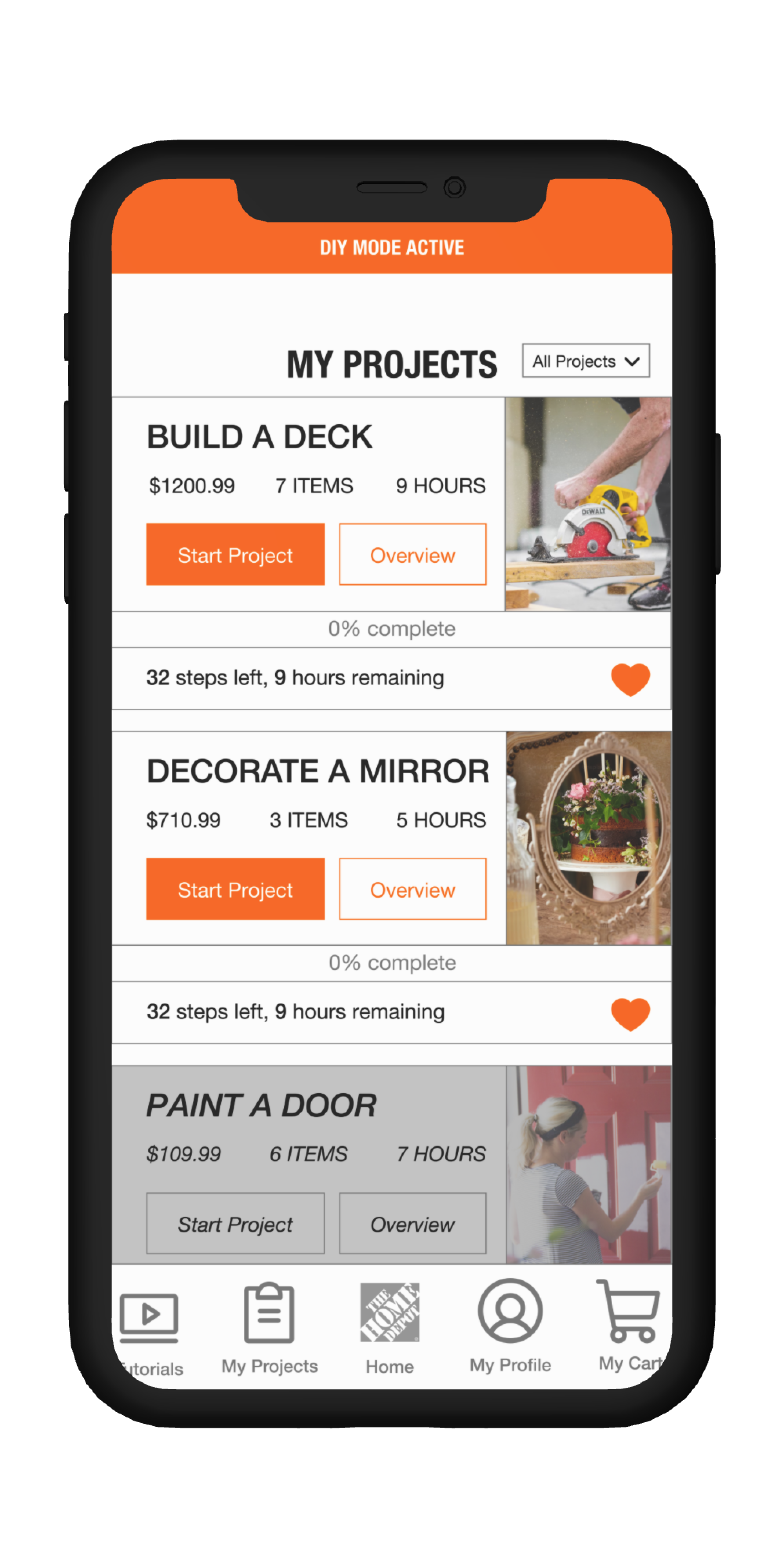
Home Depot, the home improvement shopping & DIY app, features an organization system containing step-by step tutorials by experience level, progress tracking and shopping lists, and access to expert guidance that help users complete their projects with efficiency and confidence.
Drawing inspiration from indirect competitors via C&C analysis was vital to the design process, since our concept addresses a variety of user needs.
The LEGOS app meticulously documents each piece involved in a LEGOS set, to putting those pieces together, and visualizing the finished product. This system directly influenced our Tutorial Overview, where users could review all the steps and items involved in a particular Tutorial before starting.
Figma’s tutorials are designed to incorporate both visual and written instructions that suit any user’s specific learning preferences. Similarly, we approached our Tutorials with the same mindset– to be as universally approachable as possible.
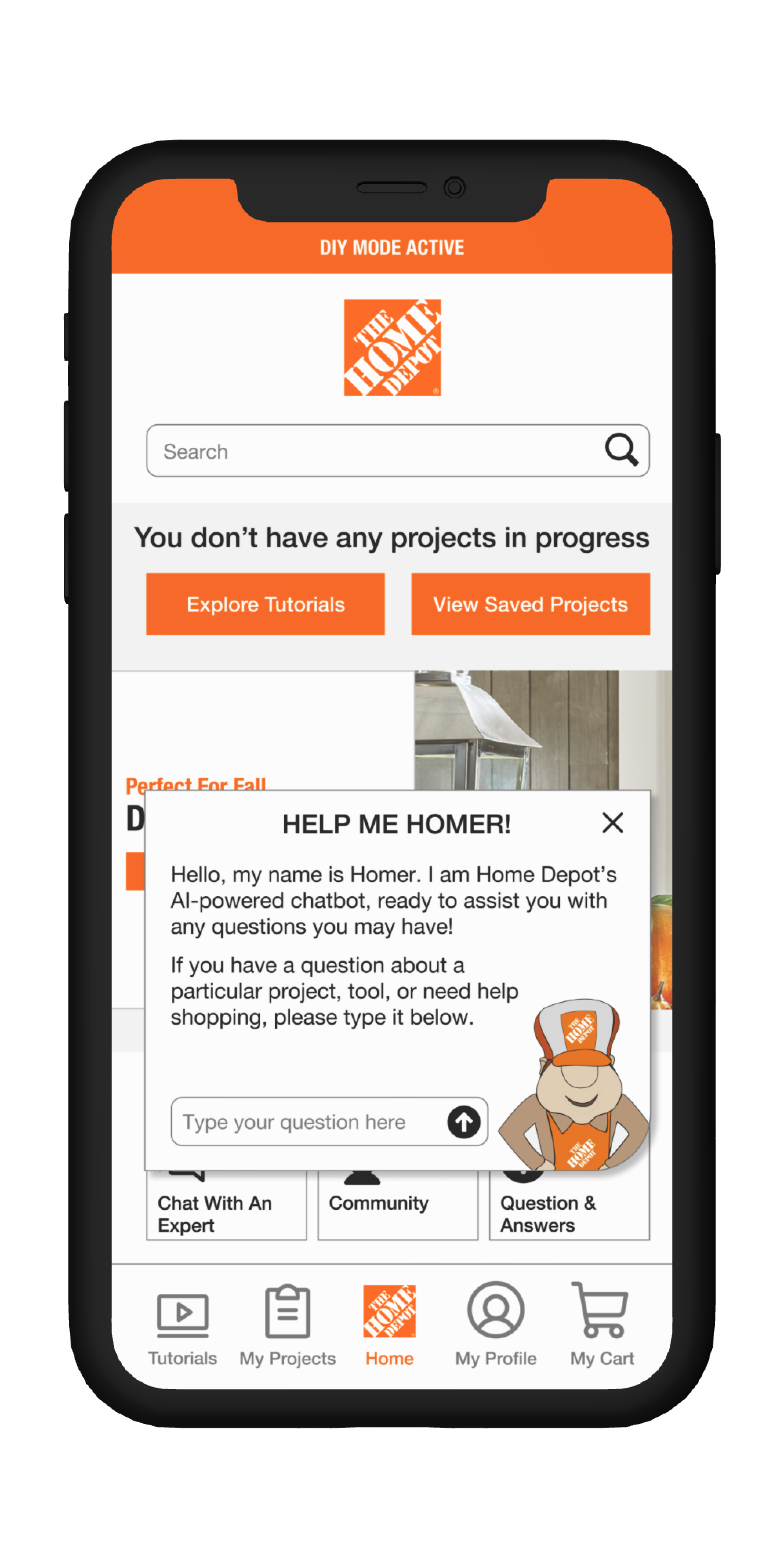
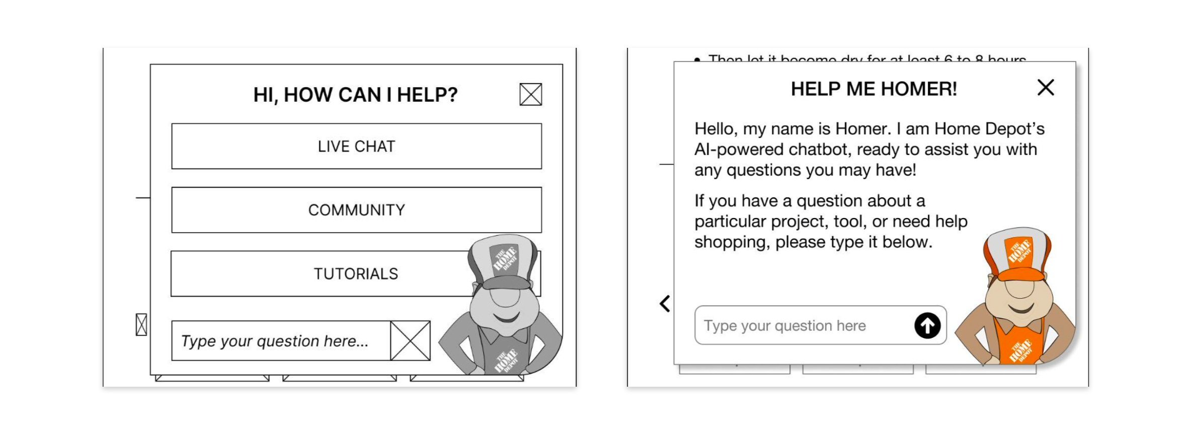
Amazon’s chat system utilizes both AI chatbots and human customer service representatives to better serve their customers and employees through improved wait times and faster question-and-answer. We would ideally implement similar AI and human assistance in our chat box, and we also created a mascot named Homer to further personalize the chat experience.
Instagram’s “Vanish Mode” utilizes a swipe-up action that leads to the entire page changing. Both the action and visual disruption is extremely eye-catching, and prompted us to apply it to how users would access our “DIY Mode” as well.
Our group’s shared design studio session revealed different design approaches to the app feature’s layout and functionalities. These individual ideas addressed multiple issues at once, and as a team, we began to weave together this multi-layered experience.
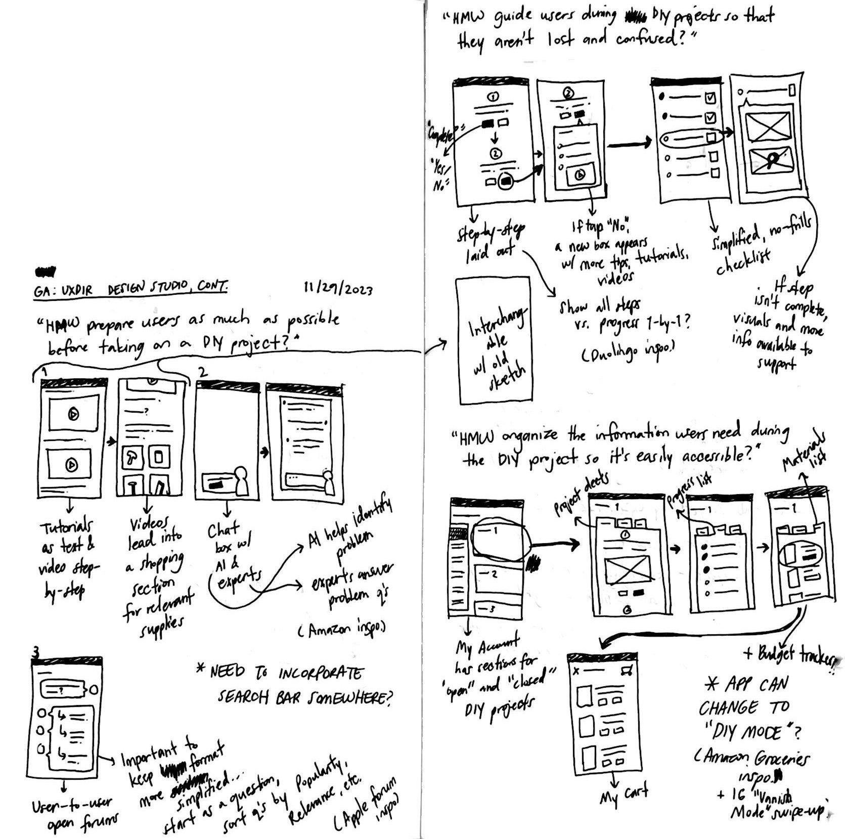

Our usability test prompt was designed to be executed in three parts to simulate a real-life scenario.
PART 1: STARTING A PROJECT
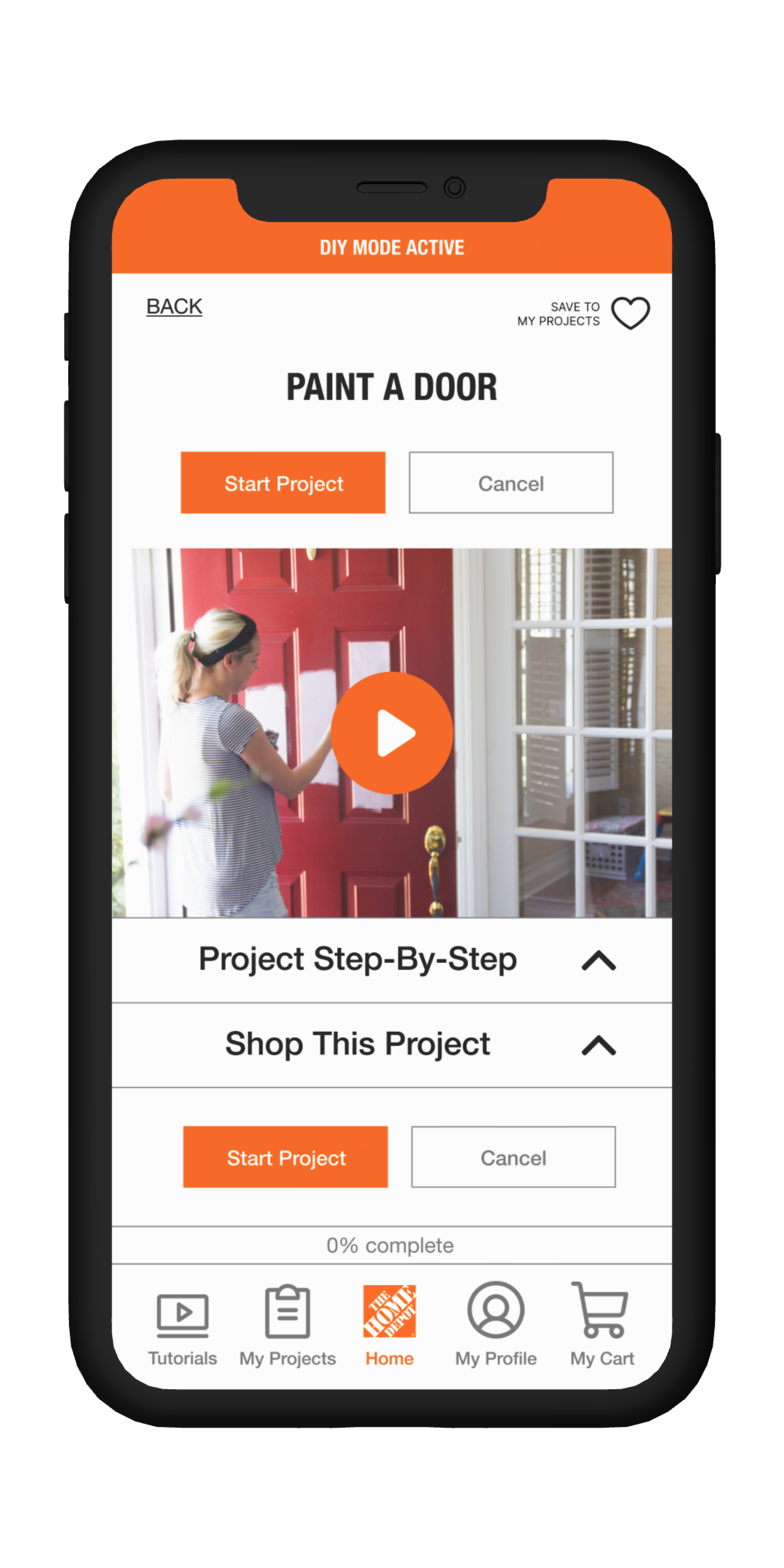
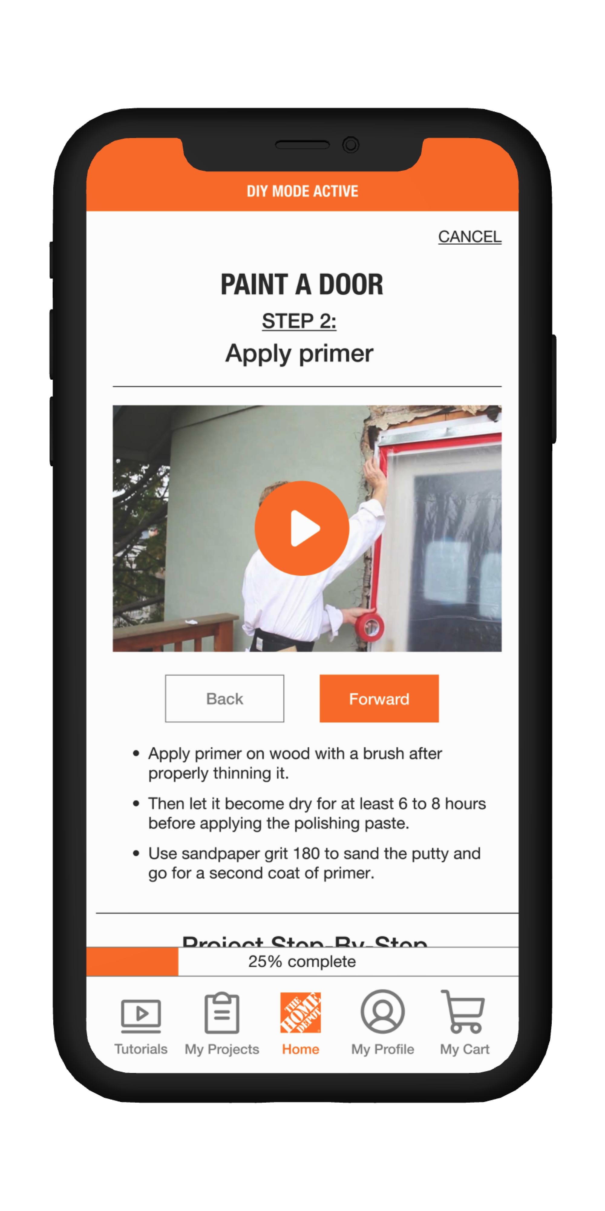
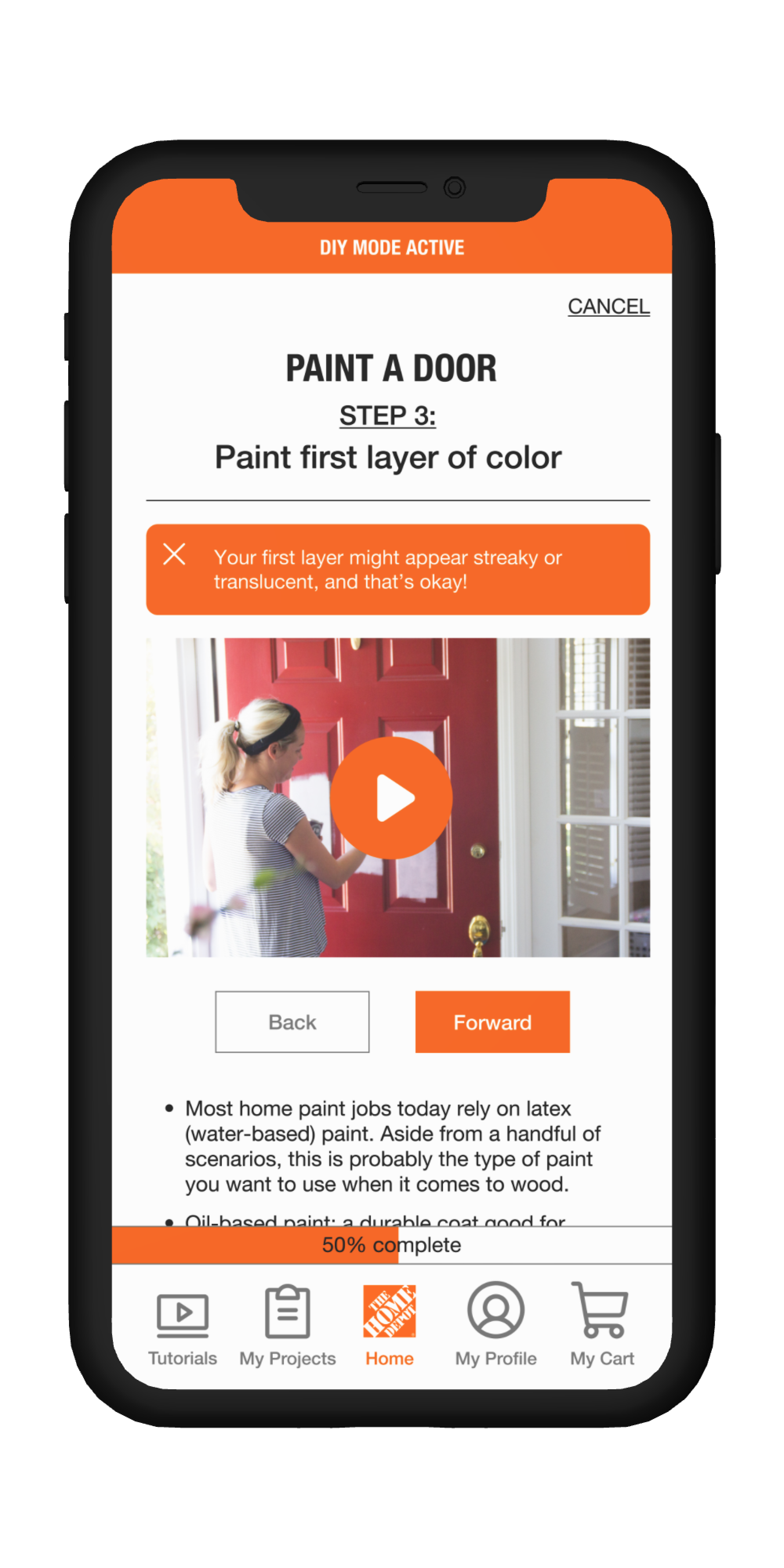
“You want to repaint your house’s front door, but have never done so before. You open Home Depot’s app and access ‘DIY Mode’. Please show what features in the app would help alleviate your inexperience.”
PART 2: ENCOUNTERING A PROBLEM
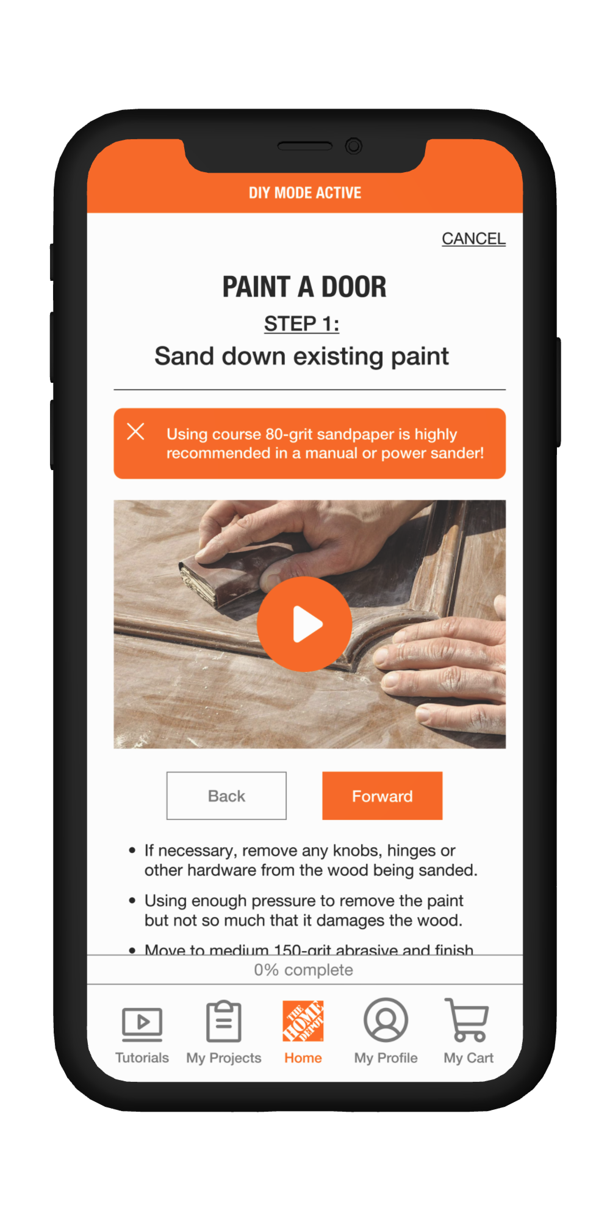
“Arriving at Step 2, you realize you don’t have enough primer. How do you get help so that you can solve your problem on the same day?”
PART 3: GETTING BACK INTO THE FLOW
“When you return from shopping at Home Depot, you reopen the app to the 'DIY Mode' homepage. How do you resume your project?”
Testing revealed a few major flaws in our low-fidelity wireframe. We learned about…
The importance of UX writing and how certain language used for a call to action can confuse a user.
Users hesitated when confronted with the original “Start” button, as they were unsure if they would be starting the introductory. video or the tutorial itself. We adjusted the button from “Start” to “Start Project” to alleviate said confusion.

How placement of certain design elements together can mislead the user about the design’s intention.
Users mistook the “0% Complete” status bar as telling them where they were in the video. We then realized that despite the UX copy being clear, it didn’t matter considering the status bar’s placement. We adjusted by moving the status bar away from the video, at the bottom of the screen near the navigation menu.

Too many options often made our user hesitate or express confusion, which was the opposite of our desired effect.
As designers, we added all the options for our user could need when seeking help, but failed to realize how overwhelming it was to choose the right option for them, especially when given no guidance. We adjusted by removing the button options altogether, replacing with an introductory prompt and single text box to begin the guided process.
Our DIY Mode is helping “Home Depot Get More Done.”
AFTER IMPLENTATION
“Project Overview” section includes Tutorial Steps and Items Checklist for optimal preparation
Tutorials utilize both video and written instructions in one easily-accessible place
Real-time help from AI and Home Depot experts alleviate specific problems quickly
BEFORE IMPLEMENTATION
Users used “Notes app, or pen and paper for planning and shopping lists
Users used Youtube, Instagram, and TikTok for tutorial videos
Users ran into unique problems that put projects at a stand-still